Walkabout App
Walkabout is a community-driven mobile app that helps users discover and engage with local experiences, people, and events. Unlike traditional social platforms, Walkabout aimed to foster real-world interactions, allowing users to join or host experiences—from hikes and creative workshops to social meetups.
My Role: Lead Product Designer (UI/UX)
Duration: Jan 2022 – June 2023
Team: 1 CEO, 2 PM, 6 Engineers, 2 QA, Myself
Tools: Figma, FigJam, Notion, Loom, Slack, Miro
Platforms: iOS, Android (Mobile-first)
Scope: Full product design from 0 → 1
2. The Problem We Wanted to Solve
During the post-pandemic world, people were craving genuine connection, but digital platforms were filled with passive scrolling, likes, and FOMO. Our CEO saw an opportunity to build a space where people could host and discover meaningful, local experiences — a platform to create, explore, and participate in offline community-driven activities.
However, this vision came with real UX and product challenges:
How to balance discovery vs. creation of experiences
How to make the app intuitive for both new users and power creators
How to support flexible payments, reviews, and trust signals
How to keep users engaged, but not glued to screens
3. Understanding the Users
We interviewed 15 early users and community hosts to understand:
Why they use social apps (and why they abandon them)
What’s broken about current event-discovery or meetup apps
What stops them from hosting or joining local events
From this, we created 2 key personas:
🎨 Alex, The Experience Host
Wants to create high-quality, personal events (photowalks, game nights)
Needs a simple way to create + manage listings, and feel in control
Seeks to build a trusted micro-community
👟 Maya, The Explorer
Loves trying new things but finds existing apps cluttered and scammy
Wants to explore easily, see who’s going, and feel safe joining
We also found that trust, transparency, and ease of use were recurring concerns.
4. Competitive Research & Opportunity Mapping
We studied players like Meetup, Eventbrite, Facebook Events, and even niche ones like Fever and AirBnB Experiences.
Findings:
Most competitors lacked a community feel — either too commercial or too generic
Complex UI for creators to set up events
No strong concept of ongoing relationships after an event
Our opportunity:
A fresh mobile-first design, focused on trust, simplicity, and ongoing engagement
Treat each “event” like a community pulse point, not just a one-off
5. User Flows & Architecture
Working closely with the PM and CEO, we mapped core flows:
Onboarding & personal interest setup
Explore events based on interest/location
Join an event → pay (if applicable) → see who's coming
Create/Host an event
Review / build community feedback
Save or follow creators
We used FigJam and whiteboard sessions to visualize the complete product journey, considering both user and business needs.


6. Design Exploration & Iteration
I began wireframing 4 key areas:
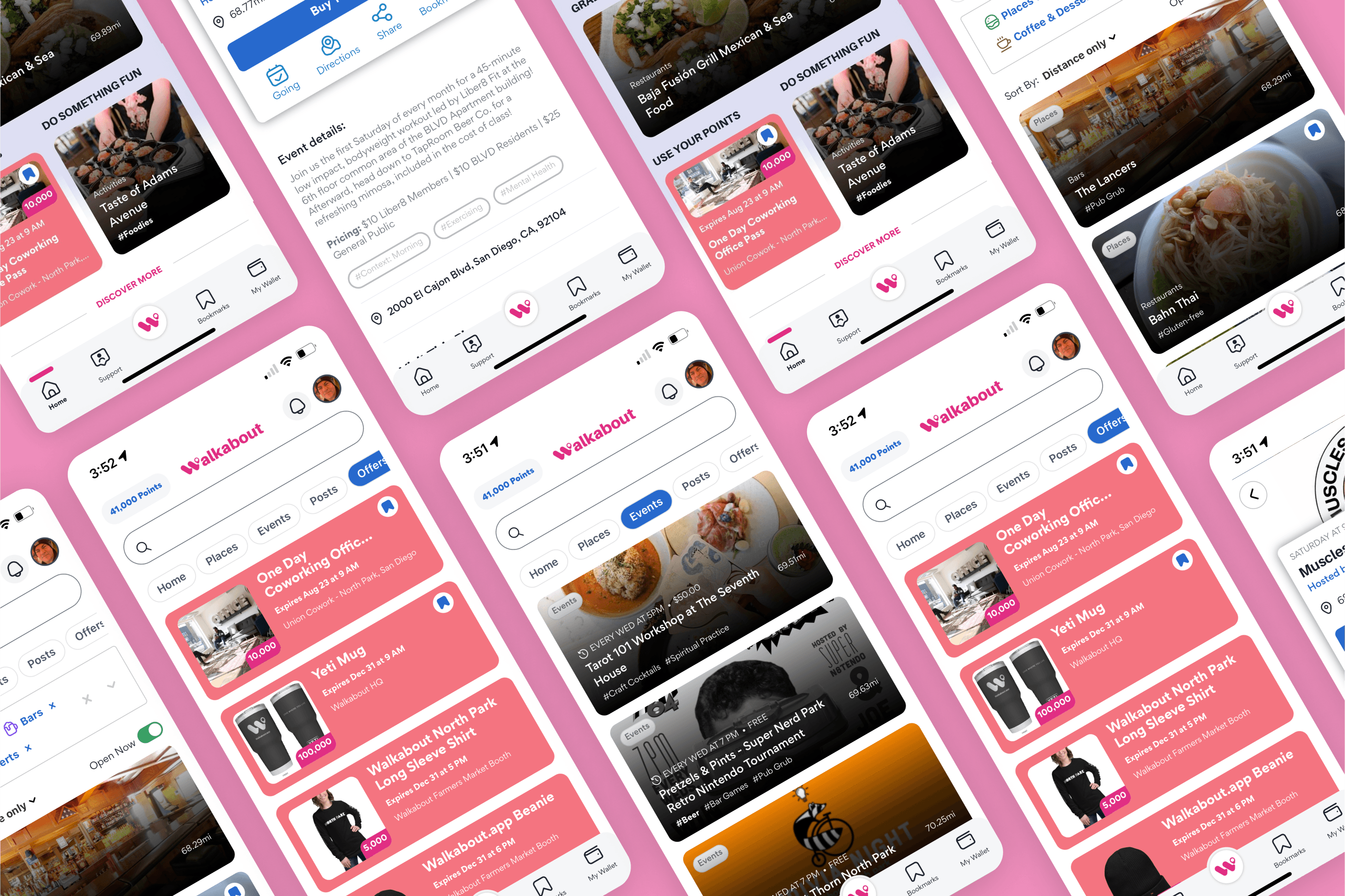
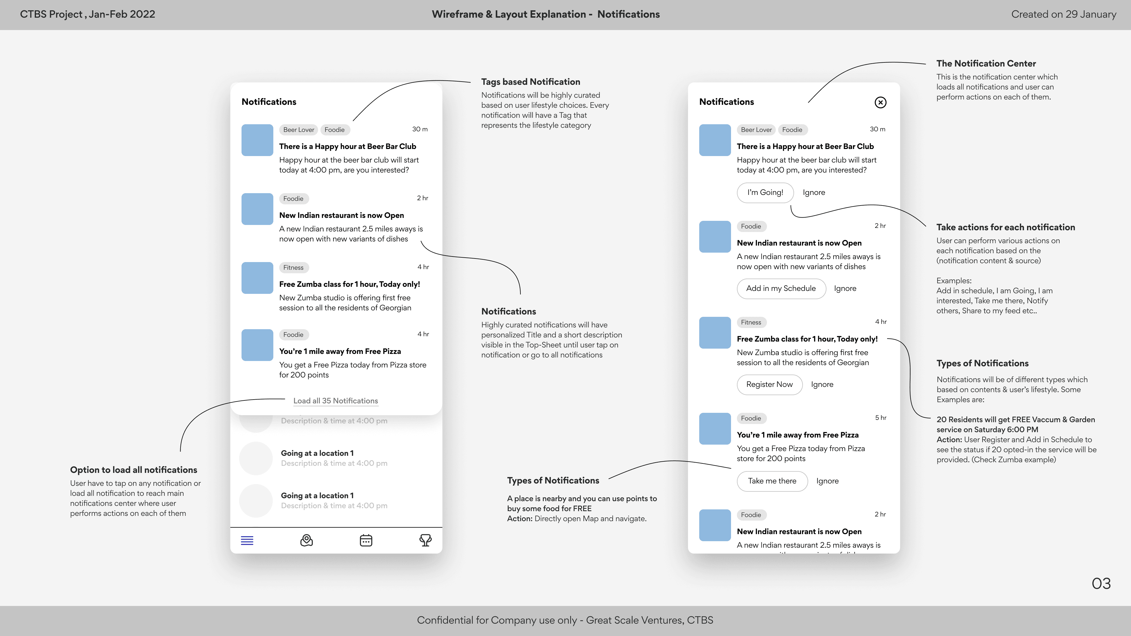
Home Feed: Community-focused, clean, not a content dump
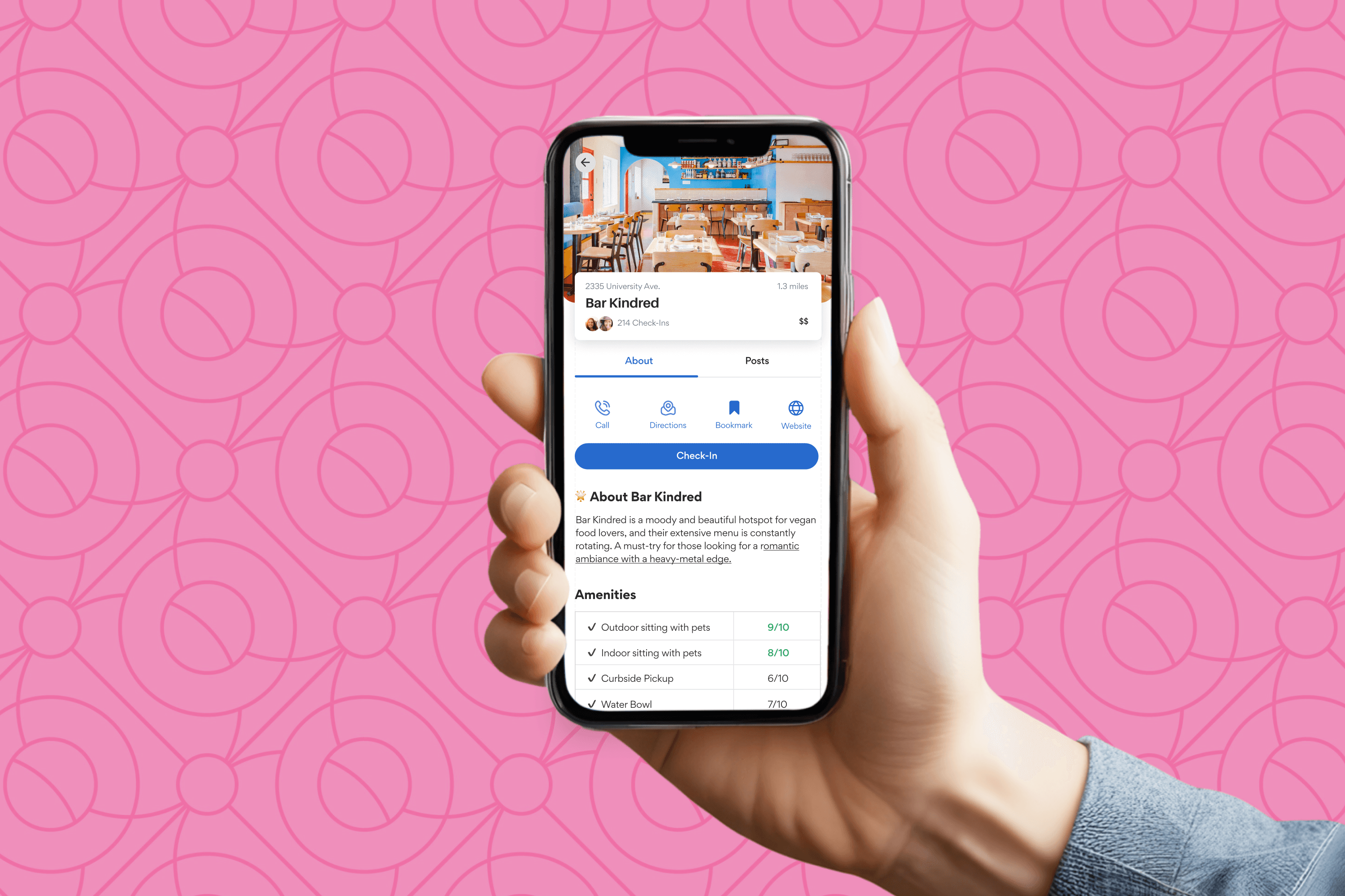
Event Detail Page: Action-focused (Join, See People Going, Ask Questions)
Host Flow: Step-by-step creation wizard
Profile & Community: Show your joined/hosted events and interactions
🎯 One major challenge was the host creation experience. We tested two versions:
A linear step-by-step flow
A flexible card-based layout with live preview
Users preferred the step-by-step version for clarity and ease.


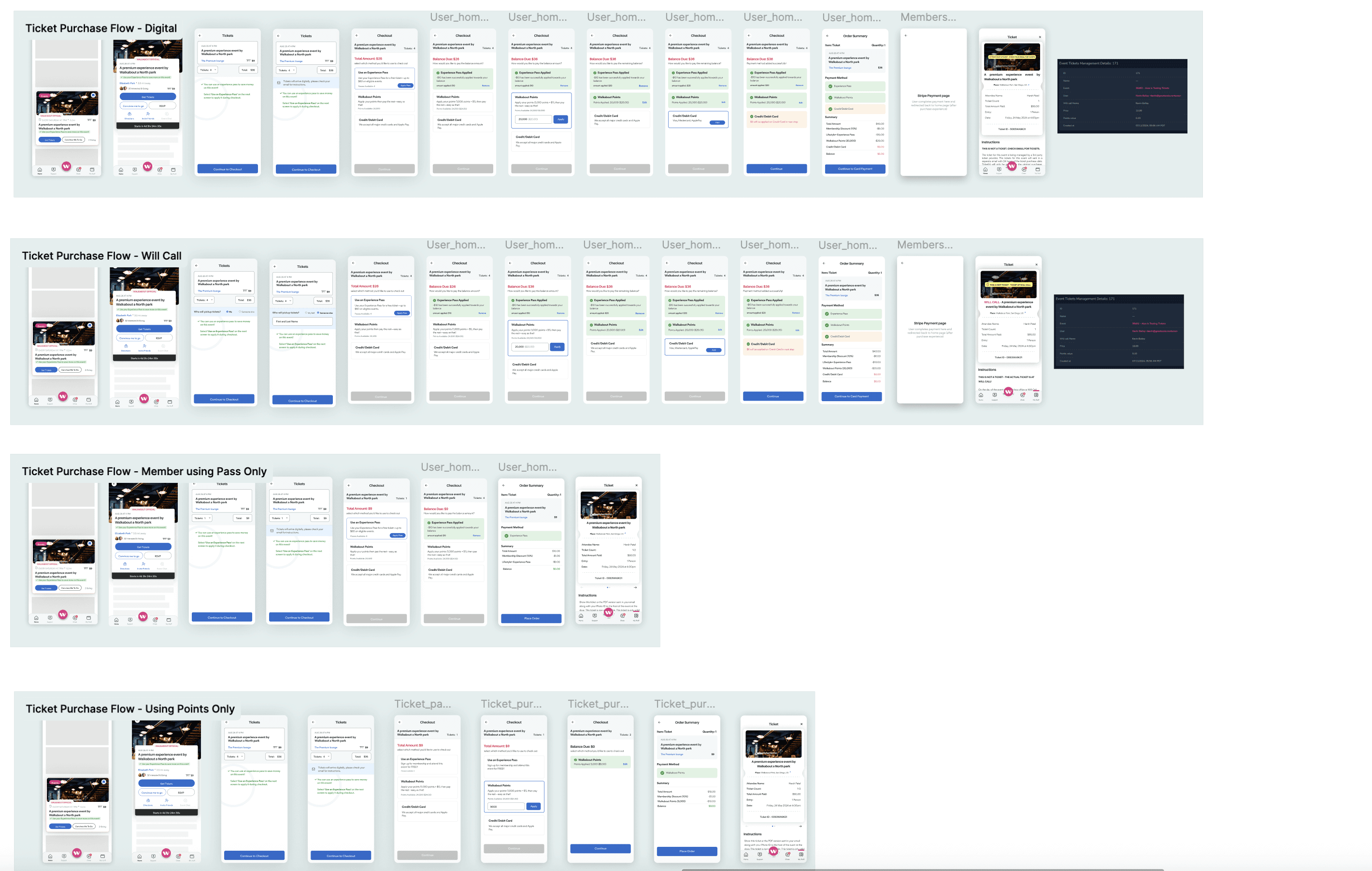
Ticketing: A Complex Layer | High Fidelity UI & Visual Language |
|---|---|
One of the most difficult parts was building the ticketing and payment flow:
We:
| I established a UI design system in Figma:
I ensured all screens were WCAG-compliant, responsive, and optimized for mobile thumb zones. |


10. Developer Handoff & Cross-Team Work
I created Figma Dev specs, component tokens, and recorded Loom videos for developers. We maintained a shared Notion Design Documentation hub.
Worked closely during sprint demos and dev QA to ensure pixel-perfect implementation. Held a design QA checklist for every release.
11. Results & Reflections
App launched to a closed beta of 500+ users with positive feedback
63% of users joined an experience within the first week
2 creators began hosting repeat monthly meetups
Users appreciated the calm UI and trust-first design
What I’m proud of:
Balancing the needs of explorers vs creators
Designing a flexible yet simple multi-payment system
Creating a community space that avoided the chaos of social feeds